Designing a Guided Journal to Enhance User Experience and Improve Retention
Overview
LePal is a gamified mental health conversational AI chatbot designed for Gen Z. It provides real time therapy and support to help users manage their mental well-being.
My Role - Product Designer
As the UX Designer for this project, I introduced guided journaling and progress tracking system, and crafted an interaction model centered on voice-based communication and improved interface design.
Team of 4 (Hover for details)


Tools


Timeline
3 Months (May 2024 - Aug 2024)
IMPACT AT A GLANCE
+
%
+
%
HIGHLIGHTS
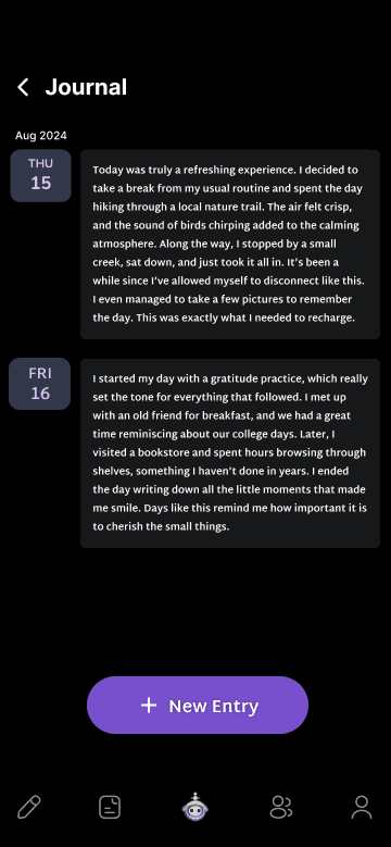
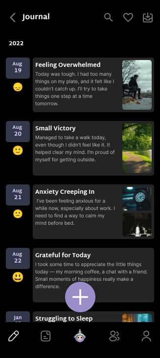
Journal Entry
Capture daily reflections and track how you’re feeling in the moment.
Activity Log
Browse a timeline of past entries with quick snapshots for context.
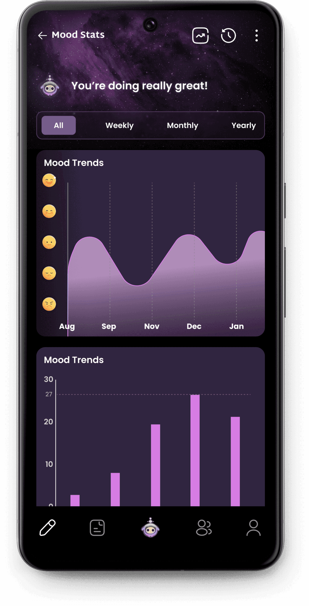
Mood Stats
Visualize trends and patterns with clear, data-driven mood insights.
Product Introduction
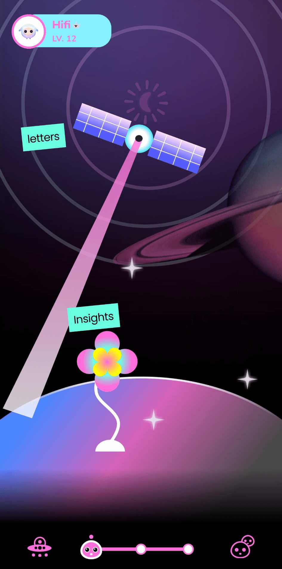
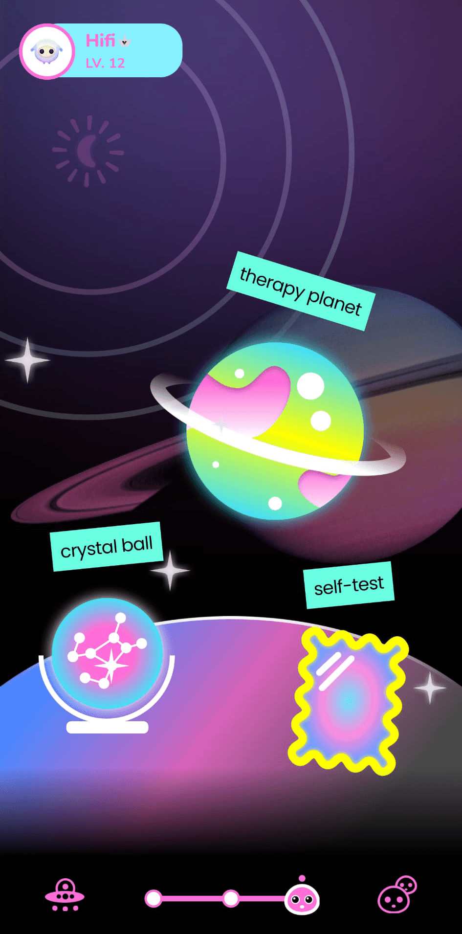
LePal is a gamified mental health app designed for Gen Z, serving features to promote emotional well-being.
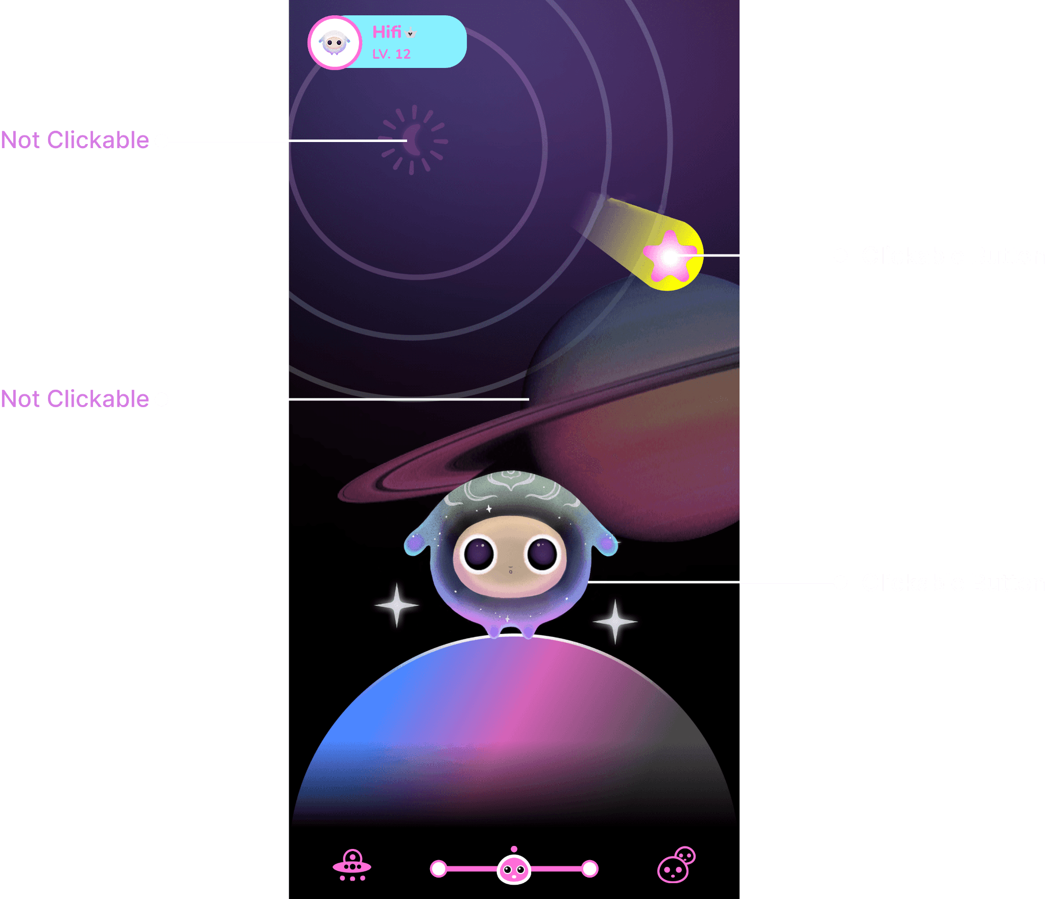
The app features a virtual spirit pet that serves as a guide, offering text-based interactions to provide support and companionship. Users can also explore features like Therapy Planet, which include short talk therapy sessions and mental health exercises aimed at fostering personal growth. Additionally, the app’s community features allow users to connect with friends, share experiences, and engage in a supportive environment that enhances both individual and social well-being.
Addressing User Drop-off
Despite its engaging premise and goal, the app experienced significant user drop-off. Stakeholders expressed uncertainty about the cause and tasked us with gathering data to identify the root causes for this drop-off and propose strategies and designs to improve user retention.
Identify the underlying causes of user drop off and improve user retention
UX Audit: Identifying Key Areas for Improvement
To gain an understanding of the app’s usability, a UX audit was conducted, aiming to identify overarching design issues and establish a baseline for future improvements. This audit highlighted critical areas where the app's design could be enhanced to better engage users and provide a more seamless experience.
Static User Experience
The app's overall user interface lacked dynamic elements, which resulted in a static user experience that failed to maintain user interest.
Poor Button Differentiation
Buttons were difficult to distinguish due to the use of similar design patterns with other decorative elements, which made it harder for users to identify interactive elements and navigate through the app.
Repetitive Layouts
The overuse of identical layouts across multiple screens led to confusion, making it difficult for users to navigate intuitively and differentiate between various sections of the app.
These observations indicated a potential need to update the design system, focusing on improved usability through better navigation, clearer differentiation of interactive elements, and more varied layouts to enhance user engagement.
User Research
Collaborating with Researchers to Uncover User Insights and Drive Design Decisions
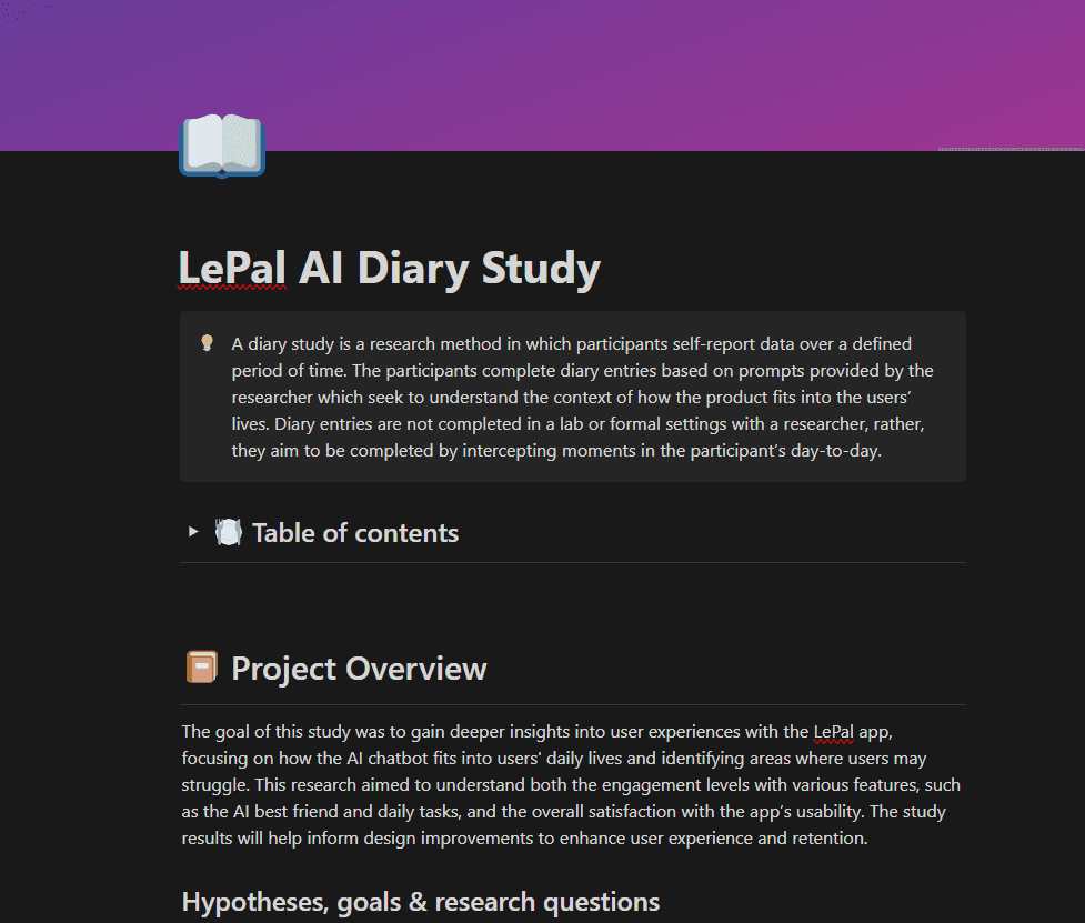
I collaborated with the research team to identify the root cause of user drop-off, understand user preferences, identify pain points, and drive design decisions based on research findings. To achieve this, we utilized two research methods: diary studies and think-aloud sessions.
Diary Studies
Think Aloud Interviews

Diary Studies
We utilized diary studies method to capture longitudinal data on how users interacted with the app throughout their daily routines, highlighting both strengths and areas for improvement. We recruited two groups of participants: existing users (those who had used LePal for at least a month but had reduced engagement) and new users (individuals unfamiliar with LePal but experienced with other mental health apps).
Process
Participants used LePal for a week, documenting their experiences in a diary, focusing on:
Interaction with the spirit pet
General navigation and usability
Findings
Lack of Meaningful Features
Participants cited boredom due to lack of meaningful features which made them lose interest in using the app.
Absence of Progress Tracking
Participants also expressed interest in a feature that would track their progress and help them build better mental health routines.
Unengaging Interface
The app was seen as static and unengaging, with no clear way to personalize the experience.
Think Aloud Interviews
We also conducted think-aloud sessions to gather real-time insights into how users navigate the app and identify any moments of confusion or frustration. During these sessions, participants were asked to verbalize their thoughts as they completed two key tasks:
Tasks
Find and interact with the spirit pet
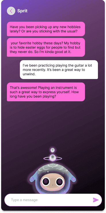
Participants engaged in a text-based interaction with the spirit pet and shared their experience. This task aimed to assess user engagement and preferences for the interaction model.
Locate and start a guided therapy session
The goal here was to evaluate the discoverability and accessibility of important features, particularly the guided therapy sessions.
Participants - 8
All participants were Gen Z & new to the app
Evaluation Metrics
Participants were assessed based on:
Task completion rate
Time taken to complete each task
Number of errors or moments of confusion
Qualitative feedback from participants during the session
Findings
Lack of Reflective Activities
Users expressed a need for reflective activities to help process emotions, which was missing in the current feature set.
Unclear Navigation
Most participants struggled to locate key features due to unclear navigation.
Voice based interaction over text
75% of participants preferred voice-based or more dynamic interaction with the app.
Stakeholder Discussion: Exploring Opportunities for Feature Development
After analyzing the findings from the diary studies and think-aloud sessions, I facilitated a discussion with key stakeholders to share research insights which highlighted a need for more engaging and meaningful features. I also wanted to understand whether there were specific business goals or strategic directions that could guide the design process and to gather ideas from the stakeholders.

Meeting Outcome
While no immediate business objectives or feature suggestions emerged, the discussion reaffirmed the importance of aligning user needs with industry trends.
Literature Review
To further identify trends and best practices in the mental health industry and gain a deeper understanding of Gen Z, I conducted a literature review to uncover potential features that could enhance user engagement in the LePal app.
Process
I reviewed a wide range of articles, case studies, and academic research focusing on mental health tools and the psychology of Gen Z. This exploration helped highlight user-centric features and approaches relevant to the target audience.
Findings
Journaling Supports Emotional Well-Being
Journaling helps reduce symptoms of depression and anxiety by offering users a space for self-expression and emotional regulation, fostering improved mental health and self-awareness. (Source)
Mood Logs Help Track Emotional Progress
Mood logs provide a simple way for users to track and reflect on their emotions over time. By identifying patterns and triggers, they support self-awareness and help users make informed decisions, fostering better engagement and emotional well-being. (Source)
4 Potential Solutions
In collaboration with UX Research team, I compiled all the data from UX Research and insights from literature review into 4 possible design solutions to improving LePal's user retention.
How might we enhance LePal by improving the existing app and introducing new features for better user engagement and support?
Opportunities
Journal
Add guided journaling to help users document thoughts and reflect.
Mood Tracking
Provide mood tracking with visual graphs for self-awareness.
Voice Interaction
Integrate voice interaction for effortless and accessible use.
Improved Navigation
Simplify navigation for easy access to key features.
Design Explorations
Exploration of the Journaling Initial Page Design
Version 1
Most Feasible to Implement
Feels too basic and lacks visual appeal, which may not engage users
Lack of mood tracking features
Version 2
Quick access to Journal History and New Entry
Users may prefer not to see their journal logs right away as it could be demotivating.
Visually does not look modern
Version 3
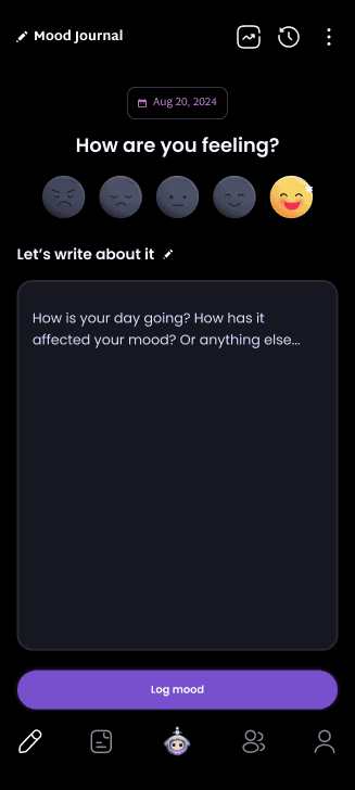
Chosen Solution
Encourages users to journal more as it's the first thing they see.
Interactive emojis provide a quick and engaging way to document emotions.
Friendly tone makes the experience approachable and user-centered.
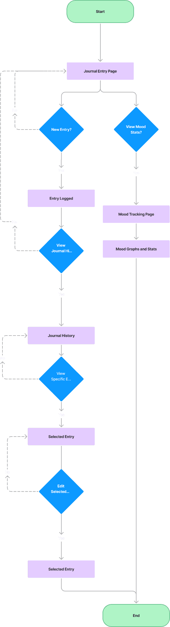
Mapping the User Journey for Journaling and Mood Tracking
I created user flows to map out the entire user journey through the journal and mood tracking features, ensuring a clear understanding of user interactions. This helped identify opportunities to streamline navigation and design an intuitive, user-centered experience.
Building Low-Fi to High-Fi Prototypes
Iterative design process from wireframes to detailed interactive prototypes.
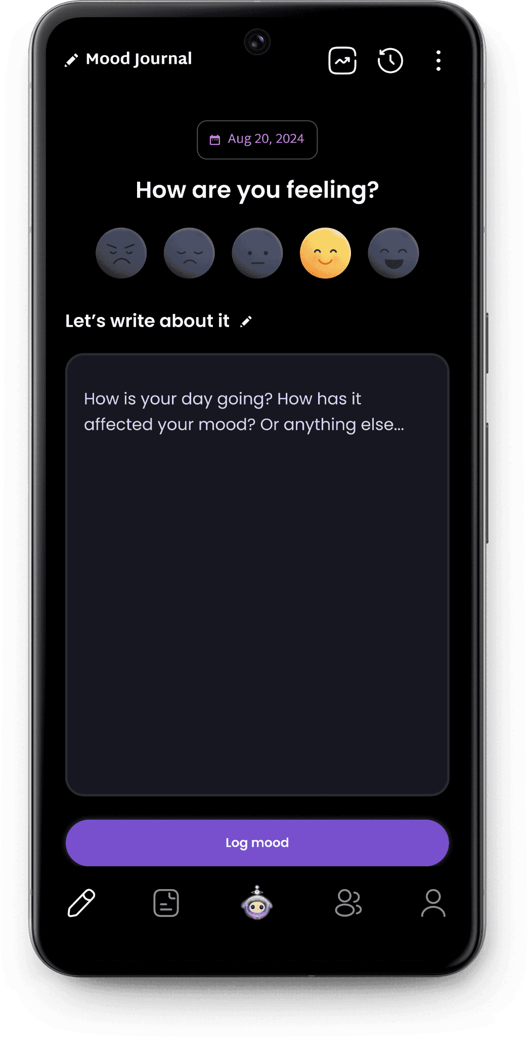
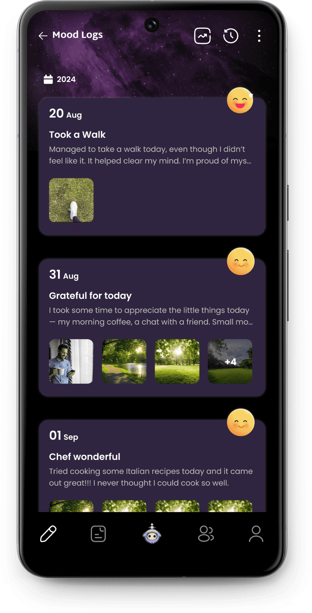
Journal Flow


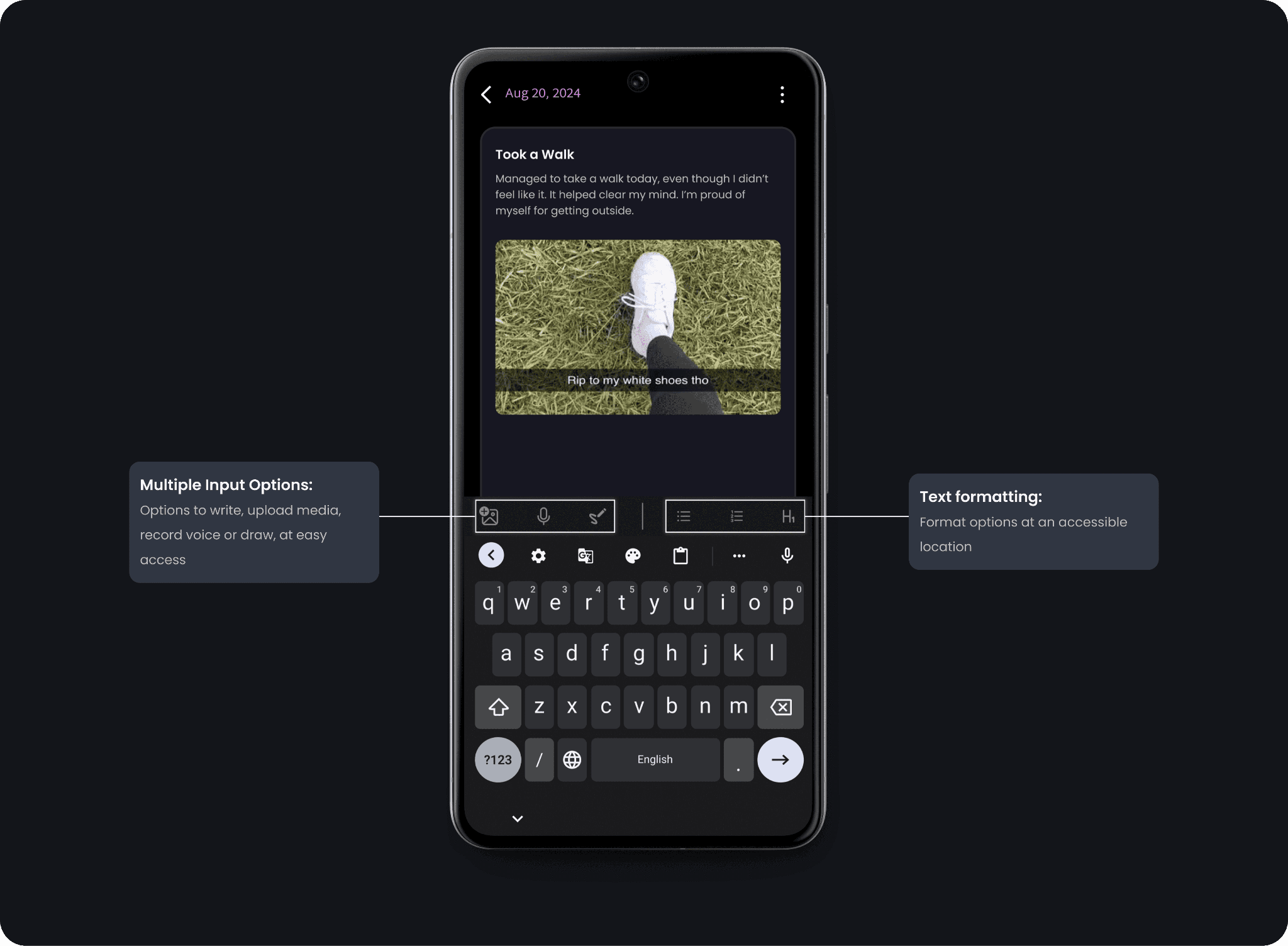
Granular Design Decision #1
Multiple input methods (text, voice, media, and drawing) were introduced to cater to diverse user preferences, ensuring flexibility in self-expression and accessibility.
Granular Design Decision #2
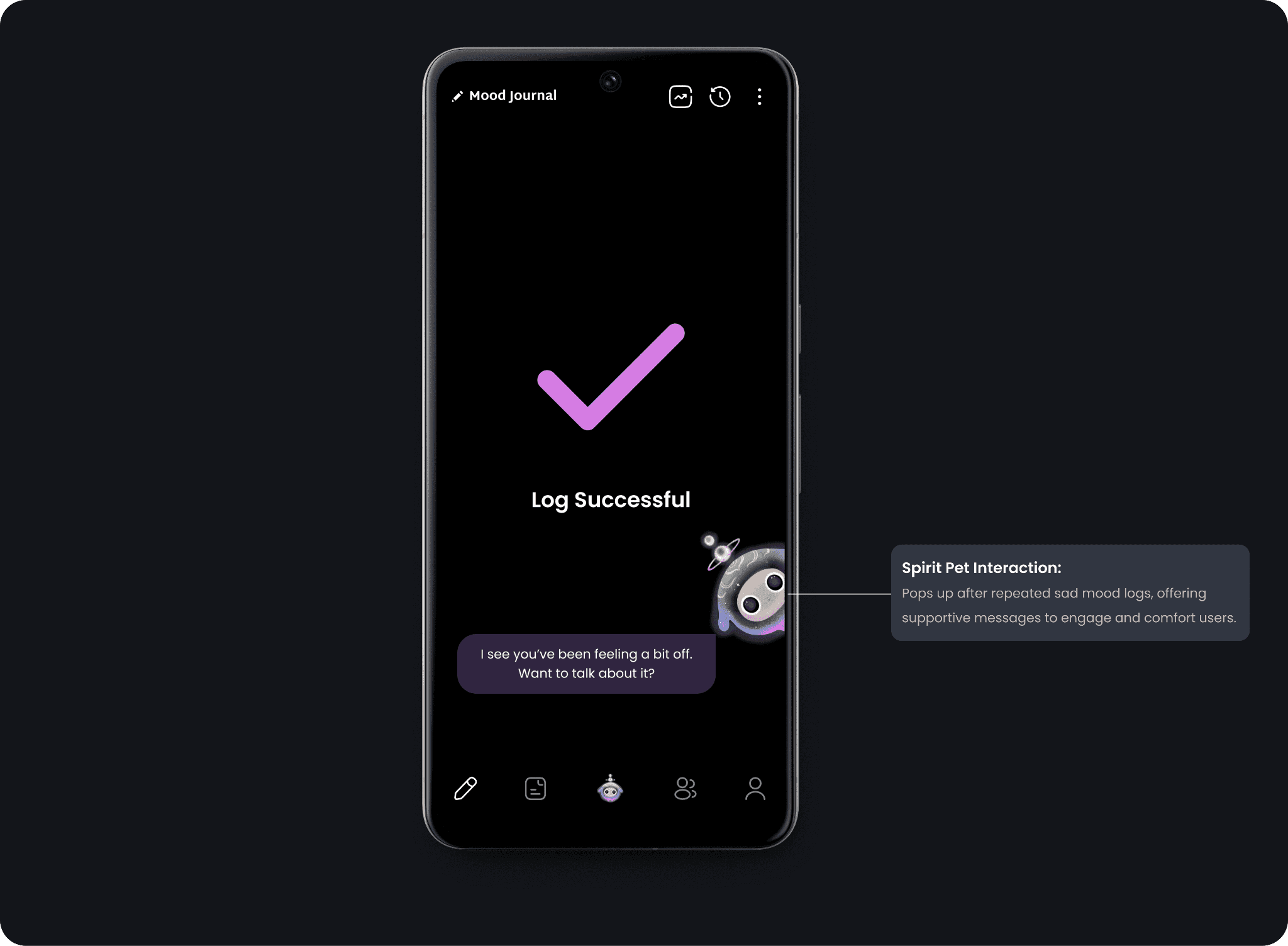
The spirit pet dynamically responds to repeated sad mood logs with supportive messages to provide emotional reassurance and encourage engagement, fostering a sense of companionship.
Granular Design Decision #3
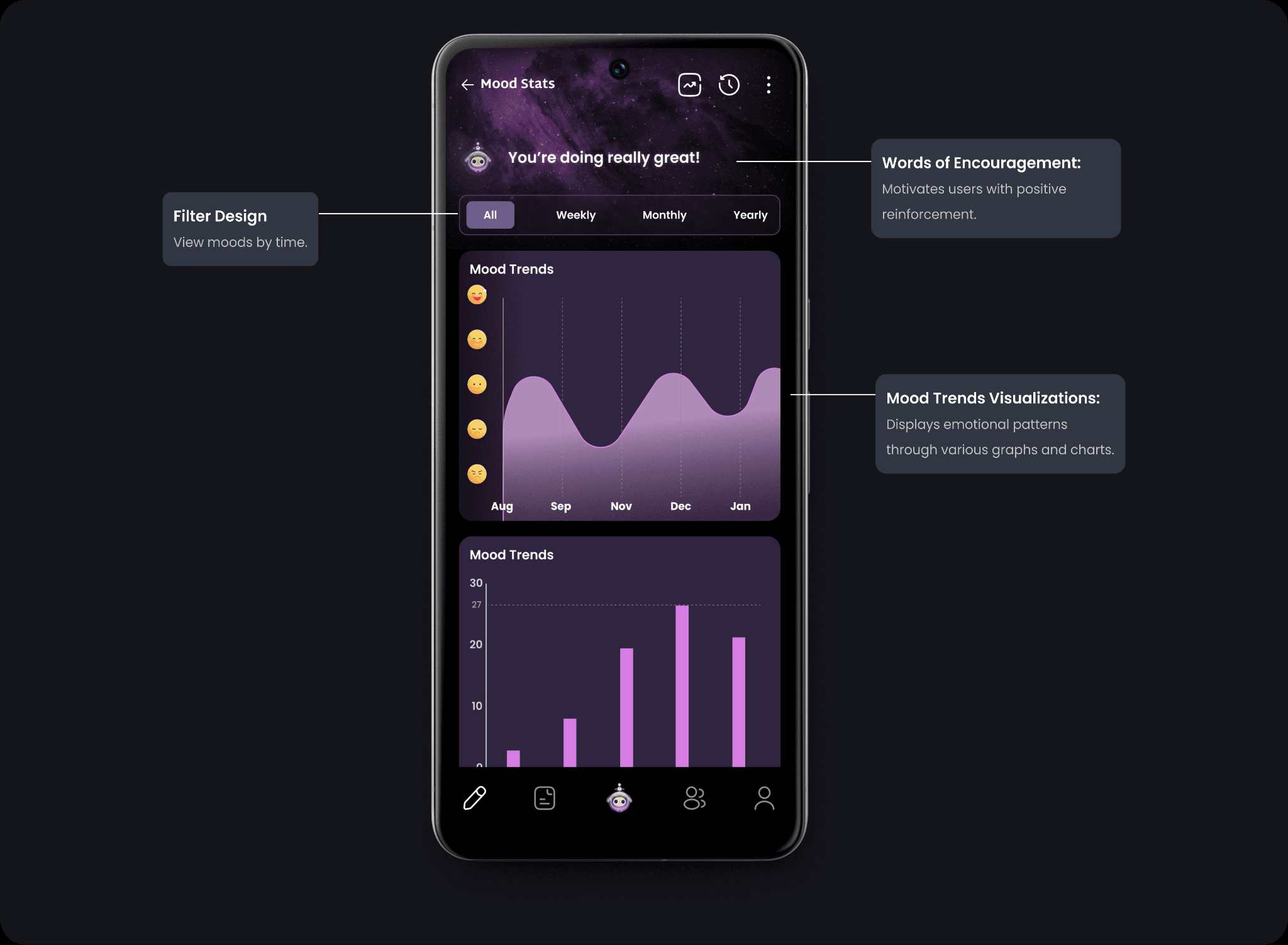
Filters and visualizations, such as line and bar graphs, were added to help users analyze mood trends over time, providing actionable insights and reinforcing the value of consistent tracking.
Design System Changes
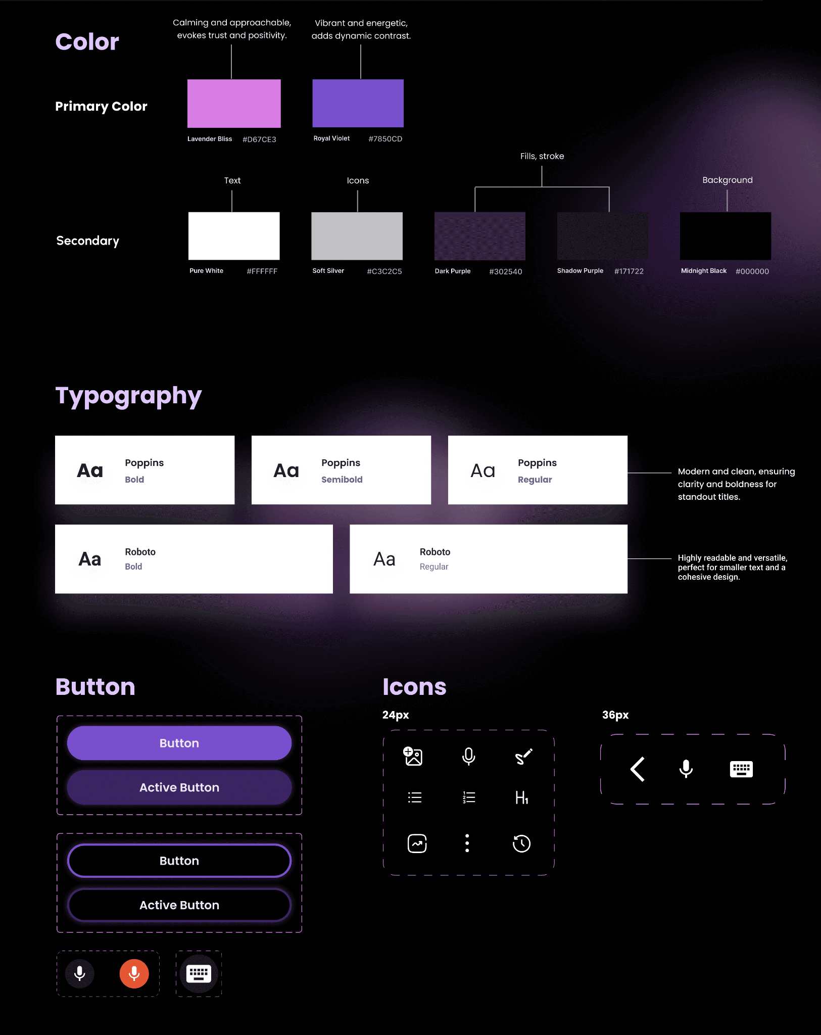
The design system was updated with a vibrant, dark theme-friendly color palette, Poppins for titles, and Roboto for body text to enhance readability. Buttons were redesigned with distinct states, and icons were standardized for consistency and usability, creating a cohesive and user-friendly experience.
Final Designs
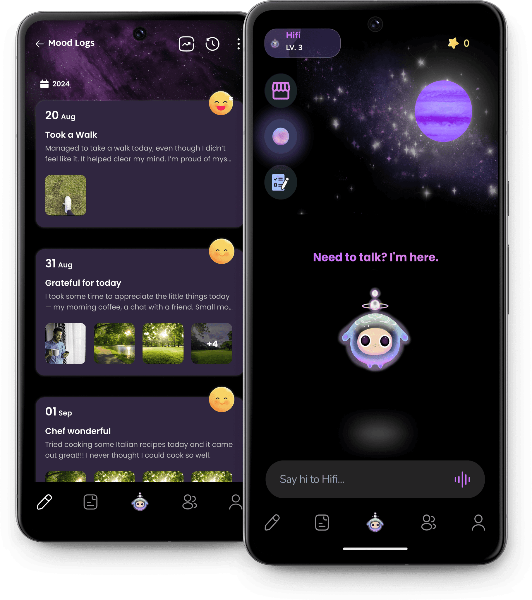
Journaling & Mood Tracking Experience
Designed to help users document their journey and reflect effortlessly, this feature integrates guided journaling with mood tracking.
Voice Interaction
Along with my work on journal, I proposed a hands-free interaction model that allows users to communicate with the spirit pet through voice, reducing effort to communicate with the spirit pet.
Homepage Redesign
Revamped to improve usability and engagement, the new homepage features a more dynamic layout with clearer navigation and interactive elements for a personalized user experience.
Evaluation
Usability Test
To assess the features, we conducted usability testing to gather participant feedback. This allowed us to evaluate ease of use and overall user satisfaction.
Tasks
8 Participants were asked to complete key tasks to assess the effectiveness of the new designs:
Log a journal entry using the mood journaling feature.
Navigate to the mood tracking dashboard and interpret the mood trends.
Use voice interaction prototype
Provide feedback on usability, navigation clarity, and overall experience.
Findings
4.5/5
User Satisfaction Score
with positive feedback on ease of use and visual appeal.
92%
Task Completion Rate
participants successfully completed all tasks without assistance.
Reflection
My Learnings
The proposed solutions effectively addressed user needs, with usability testing confirming positive feedback and strong engagement. Users particularly appreciated the redesigned interface for its improved clarity and accessibility.
If given more time, I would have further refined existing features through additional user research and expanded testing to include a more diverse audience for broader insights.
Overall, this project was a success, demonstrating the impact of thoughtful design in enhancing user experience.